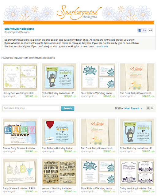
Sometimes you just need a refresh and I finally had some downtime to do just that. I tried, I really did, to not look like the hundreds of stationary/graphic design shops on etsy. I used a darker background and banner thinking that would set me apart and maybe even bump me higher. Nope. Wrong-O. But in my fight to be different I am loving this new lighter look. What do you think?


No comments:
Post a Comment